
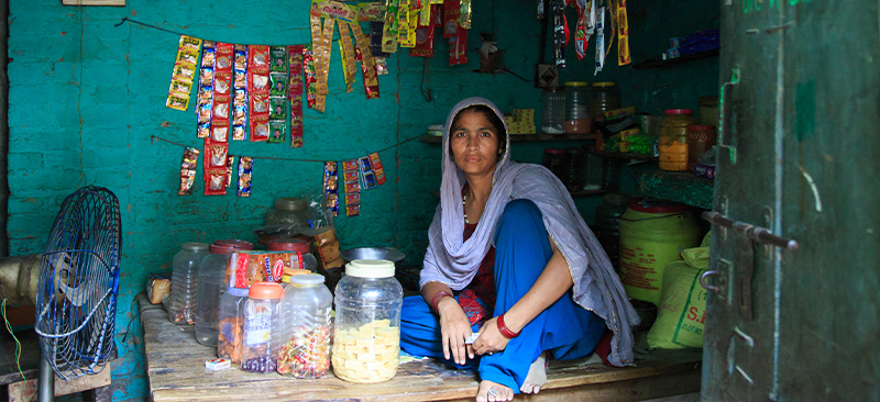
MSC can play synergic role in DBT space. MSC brought significance expertise on financial inclusion and on ground experience gained from assessment of various government schemes and interventions.
Blog
MSC Group Managing Director, Graham A.N. Wright, Live Debate from Luxembourg-Digital Finance

MSC Group Managing Director, Graham A.N. Wright, during a live talk with MFI experts in Luxembourg.In this video, Graham debunks the hype around digital credit. He goes on to state that digital credit is not a cause for celebration as it is instigating financial exclusion.
NPCI’s Take on Customer Literacy – Mr. A.P. Hota, MD & CEO, NPCI in an Interview with MSC
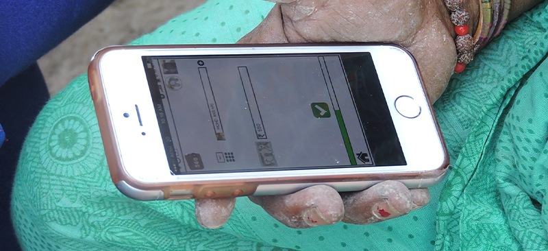
MicroSave partnered with National Payments Corporation of India (NPCI) to support NPCI in their “Digital India” initiative and promote accessibility and usage of digital modes of payments across India.
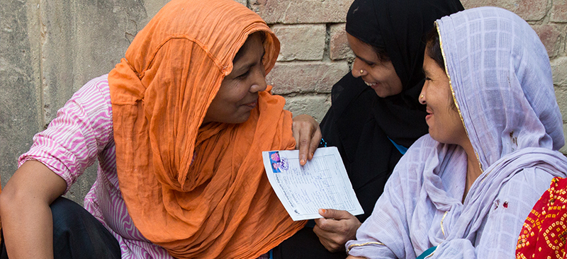
Sustainability of a Financial Literacy Campaign – Mr. A.P. Hota, MD & CEO, NPCI in an interview with MSC
Shri. A P Hota (MD & CEO of National Payments Corporation of India) in an interview with Mr. Anil Kumar Gupta (Associate Director of MicroSave) shares his views on the requirements to sustain the change brought through a financial literacy campaign
NPCI’s Message for Customers – Mr. A.P. Hota, MD & CEO, NPCI in an Interview with MSC
Shri. A P Hota (MD & CEO of National Payments Corporation of India) in an interview with Mr. Anil Kumar Gupta (Associate Director of MSC) shares the message from NPCI for the customers and the digizens of India.
Challenges of a Digital India – Mr. A.P. Hota, MD & CEO, NPCI in an Interview with MSC
Shri. A P Hota (MD & CEO of National Payments Corporation of India) in an interview with Mr. Anil Kumar Gupta (Associate Director of MicroSave) speaks about the challenges that will be faced in the journey of a digital India